Responsive web font loading, a new stategy
Optimizing Font Loading for slower mobile devices with responsive preloading and responsive font-face declarations

Responsive font display & responsive preloading font strategy
As a Core Web Vitals specialist I see different creative solutions every day. Most do not make a lot of sense but every so often I come across a strategy that is so simple and so elegant that it does make sense for certain sites.
This article explains how to implement responsive font preloading for desktops for along with font display:optional for eliminating the Flash Of Unstyled Text (FOUT) while 'default loading' the font for mobile and using font-display: swap.
tip: this strategy works well for sites with a larger critical rendering path.
The problem with early font loading
When optimizing the Core Web Vitals there is one simple rule that always applies:
"Everything that you do before the Largest Contentful Paint will slow down that Largest Contentful Paint".
This principle applies to web fonts as well. Prioritizing web font loading during page load can improve user experience, but if your site is struggling to meet Core Web Vitals thresholds, especially for specific device types, you may need to balance UX against improving LCP.
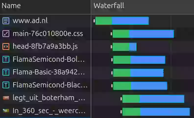
Let's consider the example below of a dutch newspaper site. On a mobile device 3 fonts are enquued before the LCP element. This makes the 3 fonts compete for early network resources and push back the image timing.

Responsive font strategy to the rescue!
In cases like this where there is much early network competition is makes sense to distinguish between device types. Typically faster desktop devices on wired (and faster network connections) can handle more early network resources all at once and it makes perfect sense to preload some critical font files.
Mobile devices on the other hand might be used on the commute to work under less than optimal network conditions. Mobile devices also often have slower CPUs and less available, less memory compared to desktops. These limitations mean that treating font loading differently based on device type can make sense.
- Desktop: Preloading fonts improves rendering performance on devices with better bandwidth and processing power. Use font-display: optional to minimize blocking and eliminate font-swapping issues. This ensures the font is only used if it’s available within 100ms of being requested while preloading ensures that the target is hit.
- Mobile: Do not preload the font because of network competition. Use font-display: swap for faster text rendering. This approach displays fallback fonts immediately while the custom font continues to load in the background, offering a better experience on less powerful devices.
Implementation Using <link rel="preload"> and Media Queries
Instead of loading the font universally, you can use the media attribute in the HTML's <link> tag along with CSS to apply different font strategies based on device types.
HTML Structure
<head>

  <!-- Preload font for desktop only -->
  <link rel="preload" href="/fonts/custom-font.woff2"
        as="font" crossorigin="anonymous"
        media="(min-width: 768px)">

  <style>
    /* Global font settings */
    @font-face {
        font-family: 'CustomFont';
        src: url('/fonts/custom-font.woff2') format('woff2');
        font-display: swap;
    }

    /* Desktop font settings */
    @media (min-width: 767px) {
      @font-face {
        font-display: optional;
      }
    }

    body {
      font-family: 'CustomFont', sans-serif;
    }
  </style>
</head>
Benefits of This Approach
- Focus on Desktop UX: Desktop renders with the web font immediately, preventing the FOUT of FOIT.
- Focus on Mobile performance:
font-display: swapensures users see text immediately, even if the custom font isn't loaded yet. - Declarative Simplicity: Avoids JavaScript, reducing complexity and enhancing maintainability.
Real-World Use Case
As told in the intro: this strategy is based on a real world example that I came across. An e-commerce website targeting both desktop and mobile users implemented this strategy. The result:
- Desktop: Improved CLS and UX with styled fonts appearing almost immediately.
- Mobile: Faster First Contentful Paint and Largest Contentful Paint ensured a fast user experience, even on slower connections.
Need your site lightning fast?
Join 500+ sites that now load faster and excel in Core Web Vitals.
- Fast on 1 or 2 sprints.
- 17+ years experience & over 500 fast sites
- Get fast and stay fast!

